Souvenir Ashtray
The dignity of ugly things
One of the most fascinating aspects of our work is meeting and getting to know the people who share our research and aesthetic interests. Often we come upon some pretty crazy situations. Some of them are so insane that they inspire us to start new collaborations! One example of this is “Cartoleena”, an Instagram account created by Lorenzo Marchionni who for a couple of years now has been using it as a platform for taking “ugly” postcards very seriously. Actually, his approach to the postcards is so serious that he analyzes them as if they were proper works of art. In doing so, he is creating his own personal and unique style, which raises the aesthetics of the ugly to the same level as that of a proper artistic movement. Anonymous photographers become new Ansel Adamses.
Unable to resist the temptation, we asked him to analyze 4 ashtrays from our book in the same manner in which he analyzes postcards… After all, the same images that were used for the ashtrays were also used for postcards, as well as other souvenirs. Here below we are presenting his selection and meticulous analysis.
Enjoy and don’t forget to follow him on Instagram afterwards.
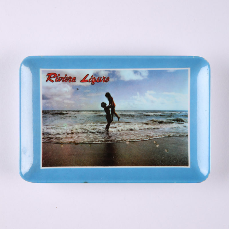
Italian Riviera

As part of the operation of creating an excess of indecipherable contraposition between the two parts of the composition, a topological line divides the image in two distinct sections, fully exploiting the figurativity of the horizon line. The sea and the sky, that have always been carriers of great expressive emotivity, become agents in a context that tries to define them as “neutral”. The spots of matter in the foreground, presumably two human figures, are gently floating in a theoretical fluid: in this act of conflation they redefine the conceptual foundations of an otherwise clichéd love.
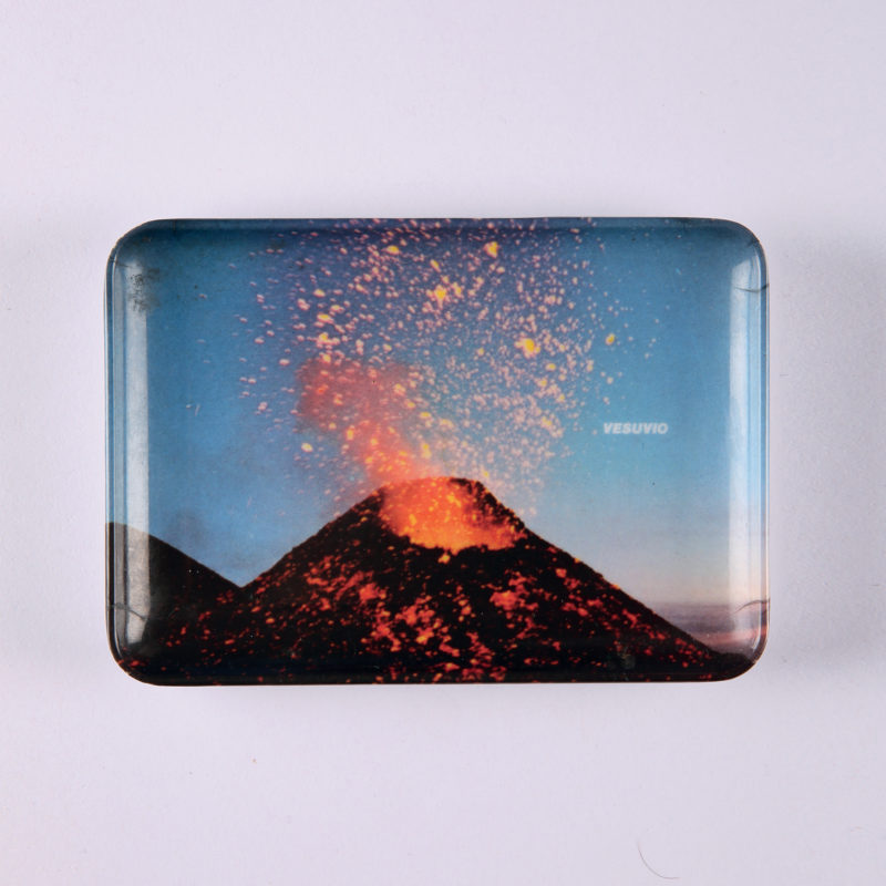
Vesuvius

I don’t think that anyone has ever been able to establish such a visceral relationship with their own artistic production. I would call this work of art (in a vain attempt to grasp its meaning) a “self-portrait of excrescences”. Such a title would fully bring out the explosive intention of the creator of this piece, who had the courage to question her own corporeity in an act of self-interpretation. We imagine a deafening explosion, which sets an interior outburst into action: like Vesuvius getting ready to explode, the artist forces herself to express, through that image, the inner manifestations of a force that has been repressed until that very moment.
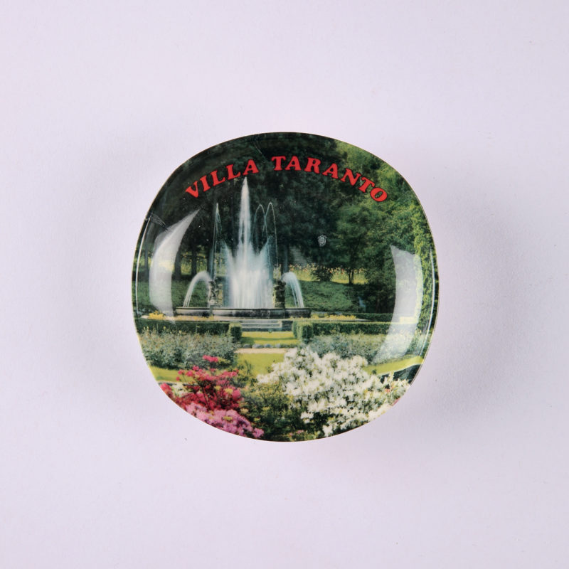
Villa Taranto

In my opinion, the aporia produced by this visual text (image) is a perfect re-elaboration of a topic that is dear to the field of mathematics. The theme of a limit, in the sense of methodically approaching an indefinite body impossible to reach, is represented in this image through various subtle messages. An almost circular support is trapping a figurative element, the fountain, which is almost centered on that support. The writing, telling us where the fountain comes from, is almost equidistant from every point of the fountain’s perimeter. Why all these “almosts”? It is pretty clear: only in this way one can fully express the meaning of the concept of aporia, an area of undecidablility, an irresolvable question.
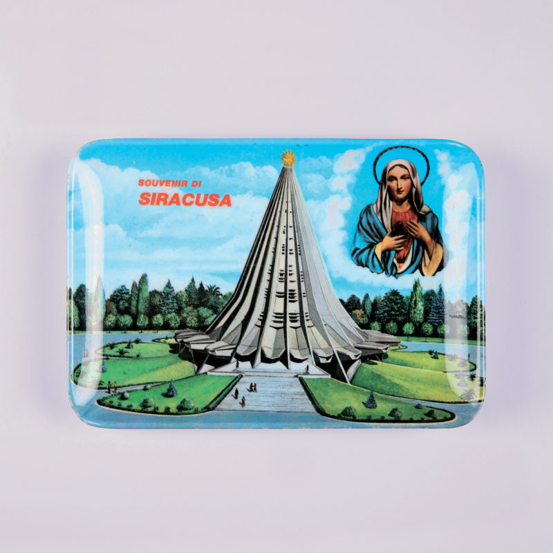
Siracuse

The levels of representation that we base our sacred images on can be of various nature. In this visual text we encounter a representational ambiguity which to me seems completely unexplored, especially in the context of history and modern and contemporary art history. The figurative forms are distributed on several levels. If it still made sense to talk about “styles”, we could probably maintain that the work bears an expressivity that implicitly refers to Warholian Pop Art. The one element that escapes the earthly logic of rationality is revealed in the way the outlines of the holy figure are represented: the white clouds, when appearing, are getting ready to suddenly concentrate around the figure of the Virgin in order to create an atmosphere of the most respectful magnificence.


 Italiano